Digital Outfitting
A feature development case study rooted in human-centered formative evaluation and iterative product design & user testing, ultimately driving customer engagement and significant business impact.
Project overview
Opportunity
The A&F and Hollister brands are increasingly bought in on the fashion merchandising strategies of matching sets and mix-and-match collections, but customers don’t have an easy way to shop complementary products.
Contribution
As the lead UX Researcher, I conducted competitive and formative research shaping discovery, followed by iterative concept and user testing to ensure strategic decisions were well-informed and design was driven by user-centered insights.
Outcome
An engaging and productive digital outfitting feature that proved through A/B testing to increase revenue per visit (RPV) by 1.8%, an annualized gain of $7 million.
-
Product Management, UX Research, UX Design, Product Channel Merchandising, Digital Analytics, and Engineering.
-
- Literature review to surface known knowns and gain context and understanding of the problem space.
- Baseline user testing to observe users as they interact with the product and identify challenges and opportunities.
- Competitive evaluation testing to understand what is and isn't working in the competitive landscape.
- Iterative user testing to refine designs from initial concepts to fully-baked solutions.
- A/B testing to evaluate the effectiveness of the feature against business objectives.
-
UserZoom, Sketch, InVision, Miro, Optimizely, Sharpr, Microsoft 365
Brand introduction
Abercrombie & Fitch (A&F) is an American lifestyle brand and international fashion retailer, and parent company of Hollister Co., Gilly Hicks, Your Personal Best, and Abercrombie Kids. With stores in 16 countries and a global ecommerce presence, Abercrombie & Fitch and Hollister are among the most recognized clothing brands worldwide.
Situation background
Our research indicates that A&F and Hollister (HCo) customers need outfitting & styling guidance when shopping online for clothes. As a company, we think of outfitting in terms of these fashion merchandising strategies:


Pairings & accessories: stylistically curated cross-category combinations
Layering: cross- or same-category pieces worn over/ under one another

Mix & match: tops & bottoms interchangeable to create a coordinated set
Matching sets: a top + a bottom, specifically designed to be worn together
Complementary products are often photographed together, but not merchandised together online
The challenge
Both brands are increasingly bought in on matching sets & mix-and-match collections, but customers have no consistent or seamless way to shop these outfits on the website or app. We’ve implemented features on the product page to promote outfitting in the past, but the use cases they serve are too narrow and limit product discovery. We need to introduce a new experience that connects customers to the matching products they’re looking for, and make it scalable to support other outfitting use cases in the future. So how should we build it?
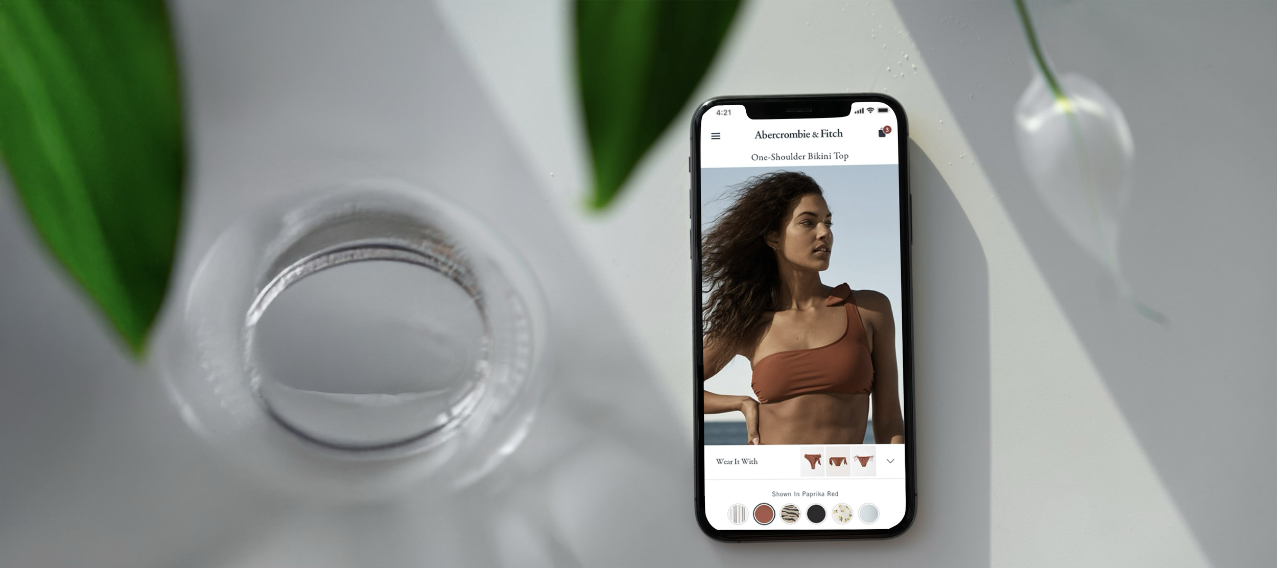
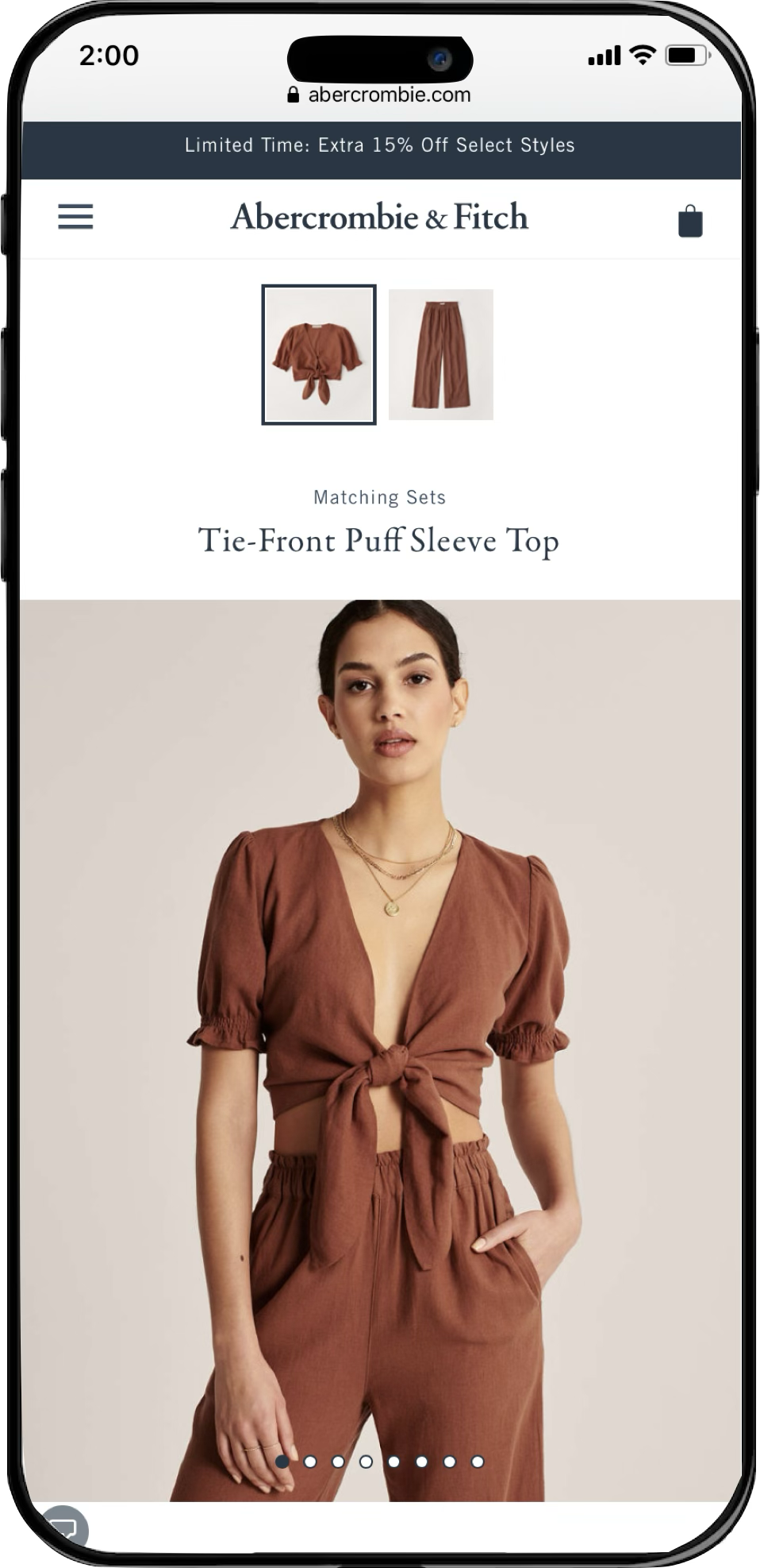
Ensemble Page
Pros: Customers can shop matching sets on a single page, high discoverability.
Cons: supports matching sets only, sold out products break experience, high level of tech effort to maintain.
Shop the Look
Pros: Customers can shop items on model, drives conversion on primary product.
Cons: only features products pictured, low engagement (<5%), only appears on model images.

Discovery phase
Before setting out to find a solution, we first needed to understand the problem space as completely as possible. In partnership with the lead Product Manager and UX Strategy Manager, I identified four key learning opportunities to help us gain the context we needed to confidently move forward.
Internal research
1) Stakeholder interviews
-
Understand the current landscape
Identify known knowns, unknown knowns, and known unknowns
Understand the impact this issue is having on internal teams
-
8 interviews dual-led by UXR and UXD
Product Manager & Product Marketing Manager for each WM for Business product
Sample of Client Success Managers
Product Analytics
Conducted via Google Meet
Note-taking in FigJam
-
Session scheduling
Discussion outline write-up
Collaborative note-taking prep
2) Literature review
-
Understand what clients need to run their businesses successfully & independently
Uncover underlying desires and expectations that are not being serviced today
Determine how client needs differ between account types and job functions
Learn firsthand about the frustrations and friction points clients have with the current experience
Develop a client hierarchy of analytics needs from must-have to nice-to-have
-
In-depth user interviews
6 WM clients, active users of WM product suite
Sample of single-location & multi-location business operators
Sample of various job functions including business owner, operations manager, and marketing manager
Conducted via UserTesting
Note-taking in UserTesting & FigJam
-
Research brief documentation
Sampling & recruitment
Session scheduling
Discussion guide write-up
Session setup & observer invites
Collaborative note-taking prep
Analysis & mapping plan
Reporting, publishing, & distribution protocol
External research
3) Competitive patterning
-
Test designs iteratively for optimal comprehension and usability
Continuously refine designs based on feedback from test participants
Document any limitations or constraints of the experience to reference during post-release evaluation
-
Moderated user tests
8 WM clients, active users of WM product suite
Sample of single-location & multi-location business operators
Sample of various job functions including business owner, operations manager, and marketing manager
Conducted via UserTesting
Note-taking in UserTesting & FigJam
-
Task & question list
Prototype management
Sampling & recruitment
Session scheduling & setup
Documentation & feedback to design
4) Formative evaluation
-
Observe customers navigating product pages to understand the experience of digital outfitting today and illuminate points of friction
Uncover customer needs and expectations around curating an outfit online and determine priority of customer considerations
Identify whether and what needs are unique to specific product categories and use cases
Identify the must-haves and nice-to-haves of a digital outfit curation experience
Understand how our competitors are supporting digital outfitting and assess the usability and effectiveness of the UX
-
Unmoderated user studies conducted via UserZoom
60 total participants
15 A&F shoppers
15 Hollister shoppers
15 Competitor 1 shoppers
15 Competitor 2 shoppers
Recruitment via IntelliZoom
Stimulus: A&F, Hollister, and 2 competitive live websites
Between-subjects study so as not to prime participants with prior stimuli
Note-taking & synthesis in Mural
-
Research brief documentation
Recruitment & screening criteria
Test setup & QA
Data collection & coding strategy
Note-taking & analysis plan
Reporting & publishing protocol
Internal research
We met with members of Product Management, Marketing, and Product Channel Merchandising to gain valuable perspective and gather requirements, considerations, and constraints. Then, I conducted a comprehensive literature review leveraging insights from existing resources within our shared cross-functional research repository, with inputs from:
User research
Ex. Demonstrating a product’s versatility increases users’ purchase confidence & drives conversion.
Customer Insights
Ex. Outfitting mindsets differ between genders, ages, seasons, and circumstances (occasion vs. everyday).
A/B test results
Ex. Exposing users to more products on a product page positively impacts order rate & revenue per visit (RPV).
Voice of the Customer
Ex. “It would be extremely helpful if the bathing suits showed matching bottoms next to the tops.” — VOC survey
Data analytics
Ex. A growing proportion of users are entering the site on a product page (about 1/3 of all visits, up +50% YOY).
External research
I set out to understand if/how our key competitors were facilitating shopping for matching sets or complete outfits (focusing on swim as the most common use case) and what design patterns may exist that our customers have come to expect. We needed to enrich our collective understanding of how user needs are/are not being met today, so I conducted evaluative user research on current product pages on our websites and the sites of two major competitors.
Through moderated and unmoderated user testing, I observed 60 participants as they curated an outfit on A&F, Hollister, or one of two competitive sites to examine the user mindset throughout the current digital shopping experience. I opted to supplement moderated tests with unmoderated ones because we needed to capture a breadth of brands, product categories, and shopping scenarios plus enough depth for a conclusive analysis, all on an aggressive project timeline.
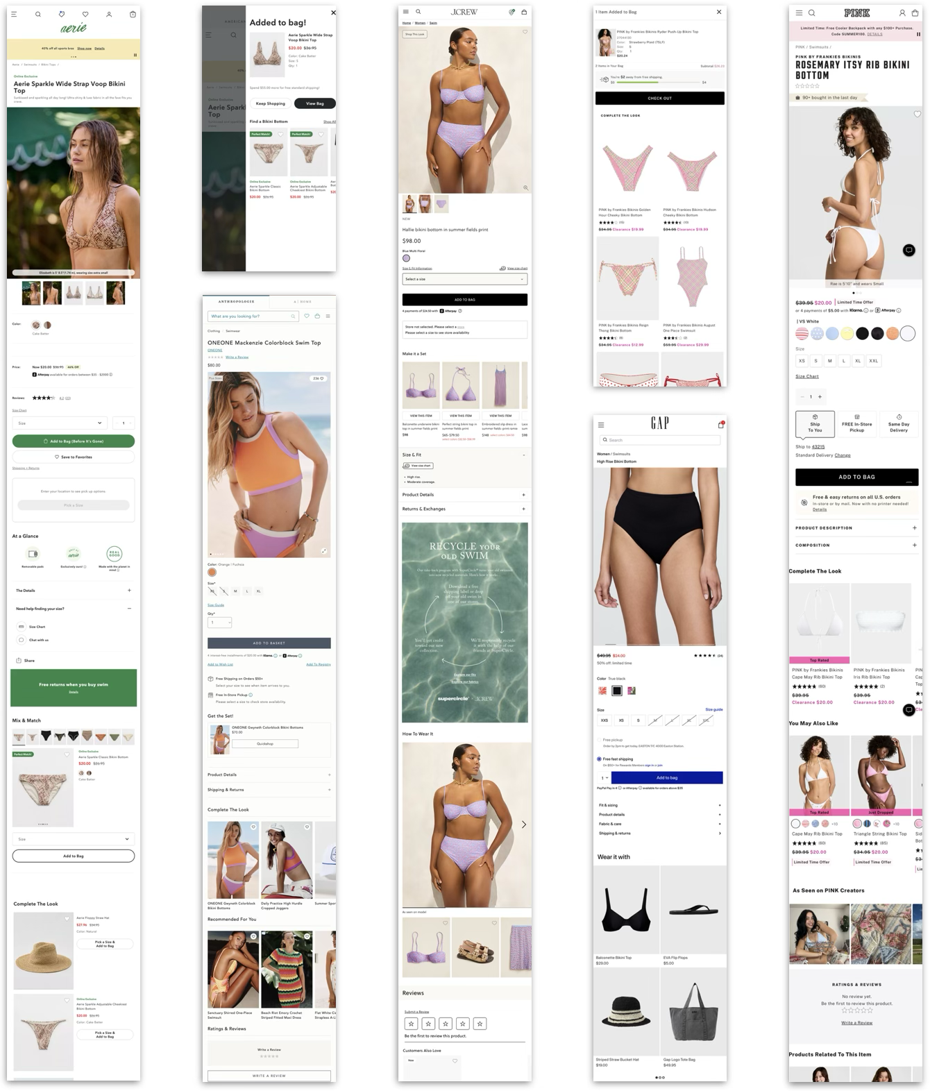

The baseline and competitive user tests were instrumental in validating some of our hypotheses, challenging others, and illuminating behavioral phenomena that we hadn’t yet considered. In all, this formative research study gleaned 30+ experience and usability findings that would inform our design strategies — a few samples:
Synthesis & formative insights
1
On-model outfit inspiration:
Model imagery creates outfitting inspiration & high demand to shop those products. The Shop the Look feature was effective, but lacked discoverability in its collapsed state.
“I can’t tell if any of these are what the model is wearing. I like the ones that she’s wearing, but I don’t know where to find those exact ones.”
— Competitive user test participant
2
Finding an exact match:
When putting together a matching set, participants were not confident in their ability to find a pairing without being led directly to the matching product(s).
“I wish when I clicked the product it would take me to that color on the next page. Now I have to hunt for the right color and I’m not sure what that is.”
— A&F user test participant
3
Navigating product pairings:
Participants wanted to consider secondary products in close proximity to the primary. Being navigated away from the primary product caused confusion and frustration.
“I wish I could compare [the products] side-by-side, right now it takes me away from the product I was originally looking at.”
— Hollister user test participant
Leveraging insights from internal and external research, the core team collaborated to generate four design strategies that would serve as heuristics for ideation and wireframing:
Design strategies
Create an operational & flexible data tool
To support each category and use case and user needs, we need to have the flexibility to show complementary products based on attributes such as color, style, pattern, or silhouette.
Create confidence in products & pairings
Customers need to be confident that products can be worn together by color, style, and pattern, as well as about the quality and fit of each item.
Help the user discover and use the tool
Prioritize discoverability and encourage engagement without distracting from the overall shopping experience.
Facilitate ease of purchase
Customers need to be able to add the primary and complementary products to bag without experiencing friction or frustration.
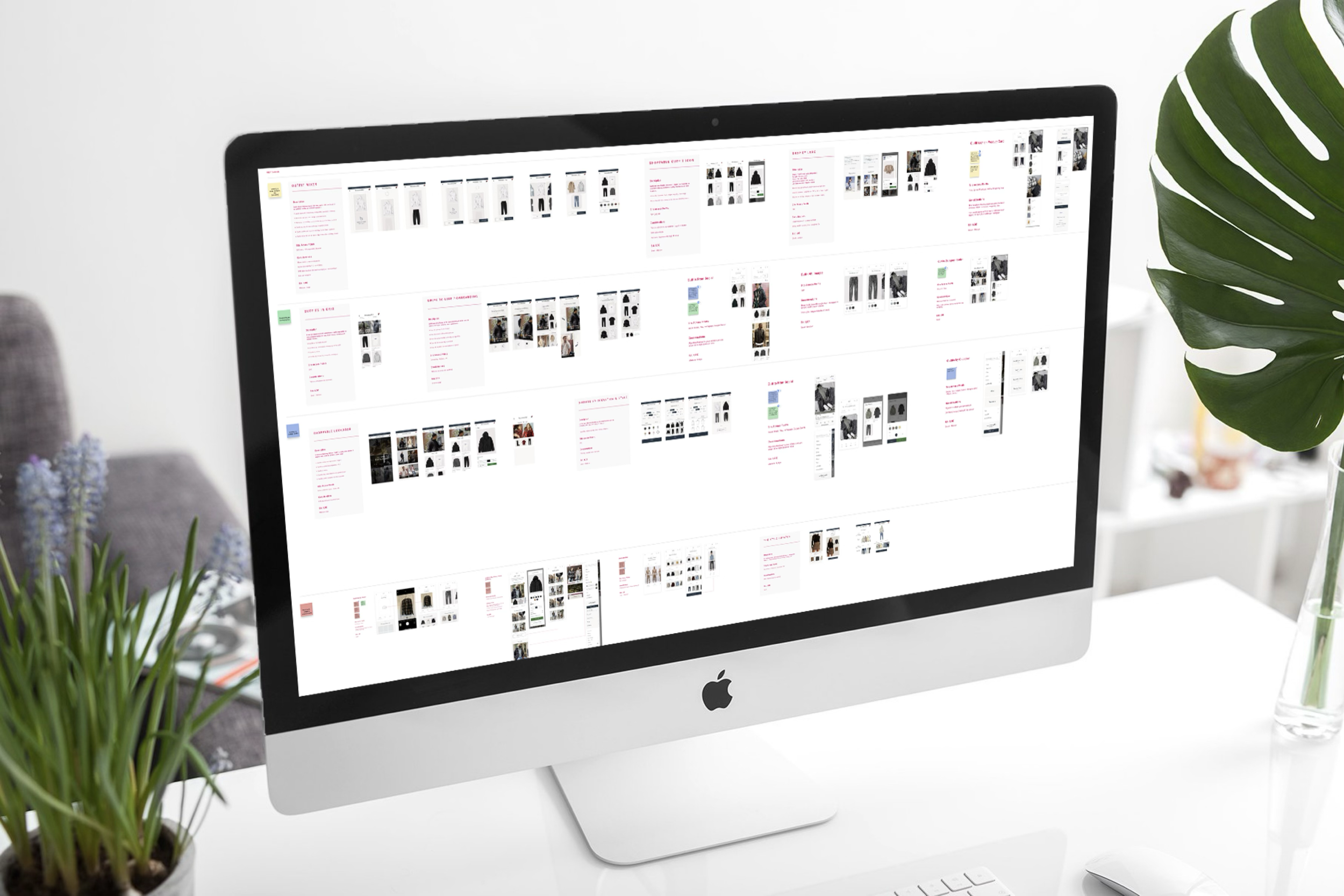
Design phase
During this phase, the two UX Designers and I took an iterative design & user testing approach, starting broadly with blue-sky ideation and narrowing in on the final, optimized design.
We conducted three rounds of design & testing, evolving our focus as we progressed through each:
1) Early concepts to flesh out ideas and determine a direction
2) Interaction design to refine the how the user interfaces with the feature
3) Usability to optimize discoverability, ease of use, and usefulness
Test 1: early concepts
We know that users expect product recommendation components to be present on the product page, and are used to finding them below the fold. UX Designers Cameron and Sierra and I wanted to test placement strategies to determine where a digital outfitting feature would be the most discoverable and intuitive.
-
Unmoderated usability test via UserZoom
-
n = 45
Sample of A&F and HCo shoppers
Sample of Men’s and Women’s shoppers
Sample relevant product categories (swim, lounge, intimates, fashion sets)
US only
-
Buy Grid: carousel component lives below the “Add to Bag” CTA
Accordion: expandable drawer component lives directly below the primary product images
Interactive Banner: users can select featured products to assess next to primary product
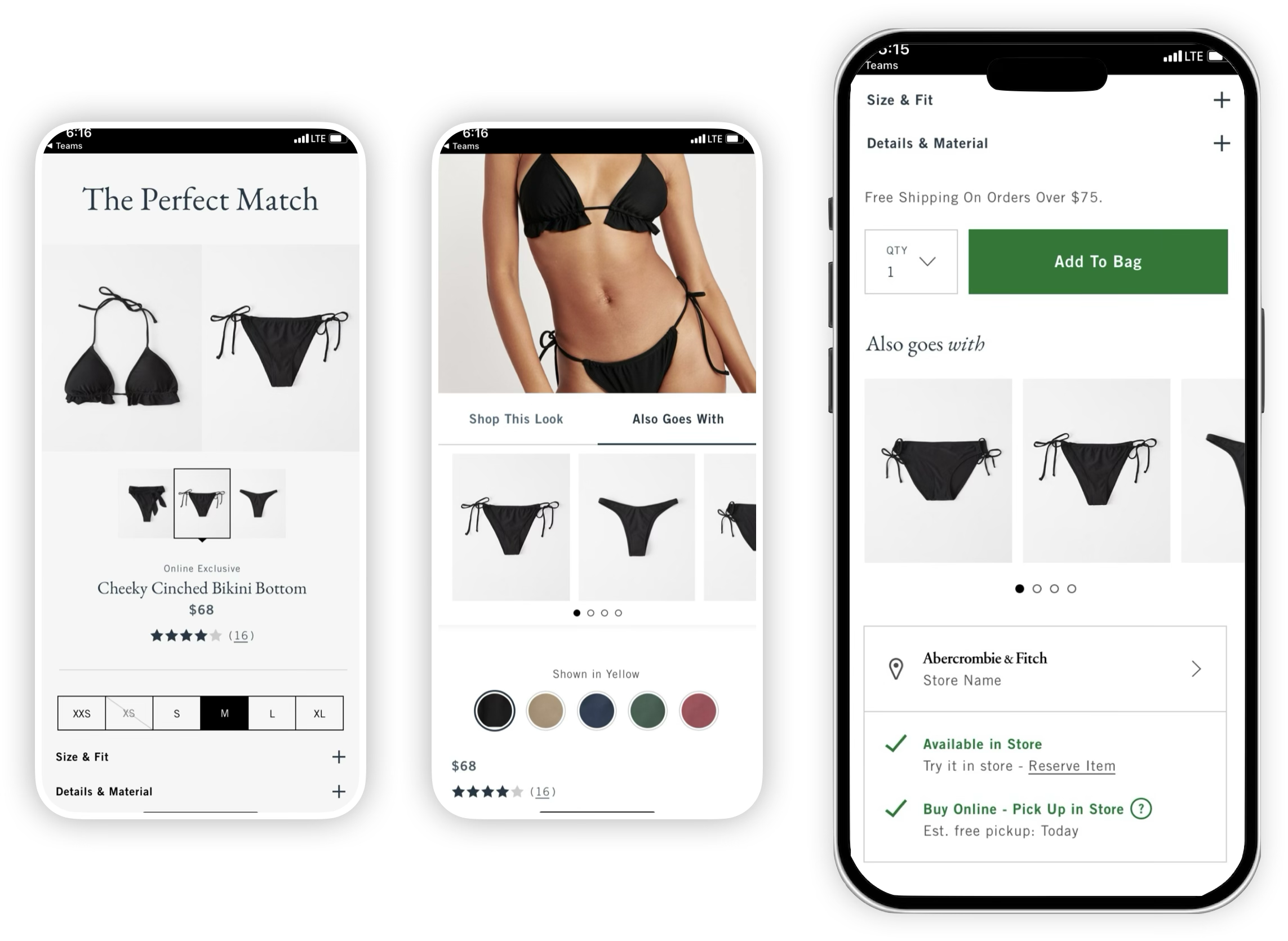
Interactive banner
Buy grid
Accordion
**Winner**
Results:
Participants responded positively when secondary product was in close proximity to the primary, citing a preference to keep the primary product in view for side-by-side assessment.
The buy grid variation was discoverable and familiar to users, but didn’t encourage engagement.
More information about secondary products is desired (i.e. product name and price) - these help participants understand their options and reach a purchase decision faster.
Test 2: interaction design
Building on learnings from Test 1, the design team explored complementary product interactions in close proximity to the primary product images, testing both design variations with 8 users at a time then iterating upon them according to user feedback.
We also made the decision to absorb Shop the Look into the new design, with a strong emphasis on protecting the elements of that feature that are successful today.
-
Moderated in-person + unmoderated usability studies via UserZoom
-
n = 32 (6 moderated)
Sample of A&F and HCo shoppers
Sample of Men’s and Women’s shoppers
Sample relevant product categories (swim, lounge, intimates, fashion sets)
US only
-
Accordion : expandable component directly below the primary product image (4 iterations)
Modal: launched from CTA directly below the primary product image (4 iterations)
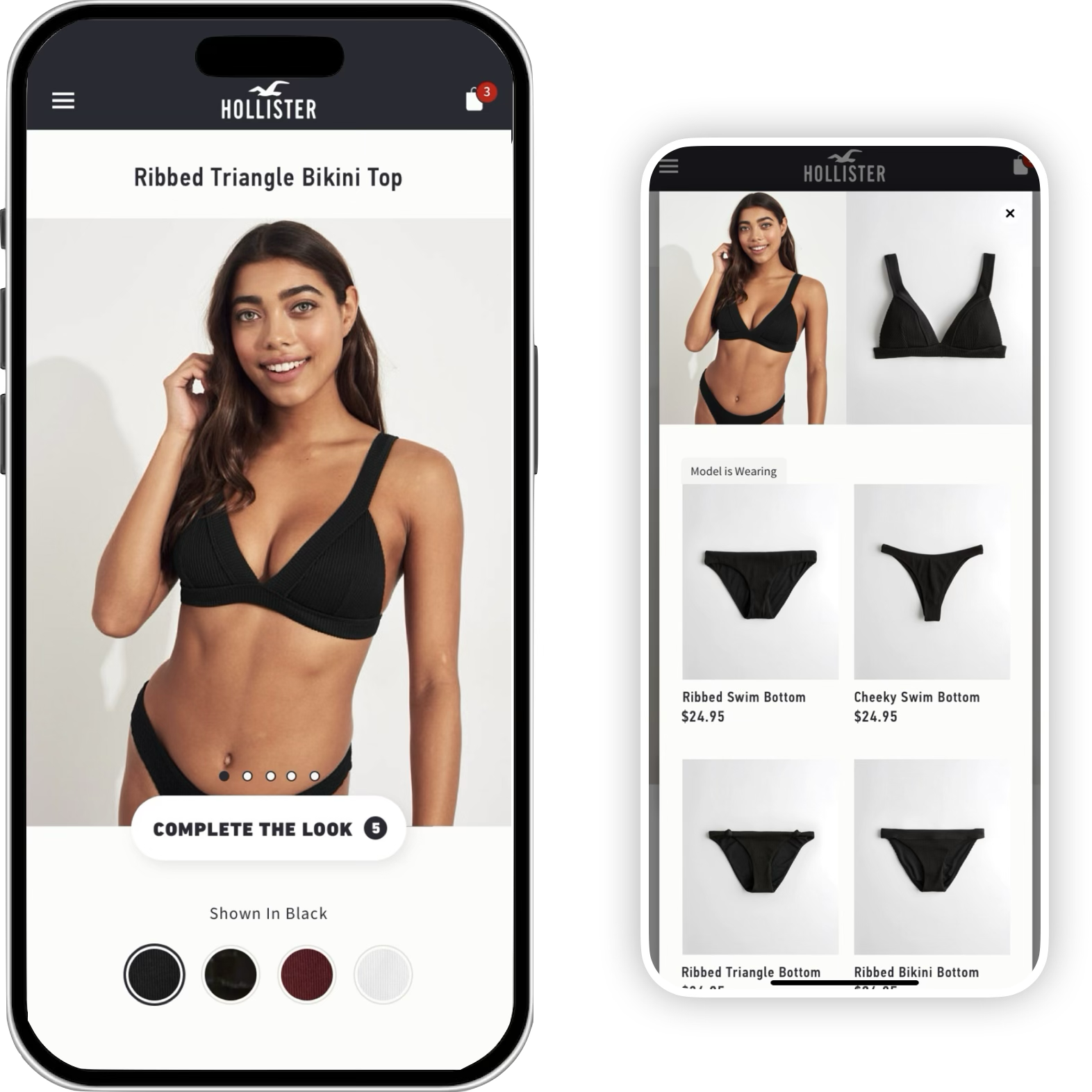
Modal
Accordion findings
When clicking a featured product, few expected to see the primary product image change rather than quick-view modal.
‘Model is wearing’ labeling is highly valuable.
Participants preferred the feature to be expanded upon page entry but collapsable.
4-5 featured products is the sweet spot
Modal findings
When clicking a featured product, most expected to be taken to another product page vs. quick-view modal (business risk).
Participants want to see multiple images of the primary product within the modal, or the ability to swipe through them.
Item count indicator on CTA is understood but not valuable.
“[Accordion] is a cleaner, more streamlined experience…I would definitely prefer seeing the pairings right away instead of having to click into something without knowing where it’ll take me.”
Results: While the Modal struck participants as more immersive and original, the Accordion ultimately allowed for simpler comparison of options. Additionally, stakeholders pointed out that there would rarely be enough relevant products to feature in the modal design. For those reasons, we progressed with the Accordion design.
Test 3: usability
Once the Accordion design was refined, I performed a final round of evaluative user testing to optimize usability and ensure that the feature’s functionality aligned with user expectations.
-
Unmoderated usability studies via UserZoom
-
n = 60
Sample of A&F and HCo shoppers
Sample of Men’s and Women’s shoppers
Sample relevant product categories (swim, lounge, intimates, fashion sets)
US only
Results:
56/60 users organically discovered the feature.
51/60 said the interaction aligned with their expectations.
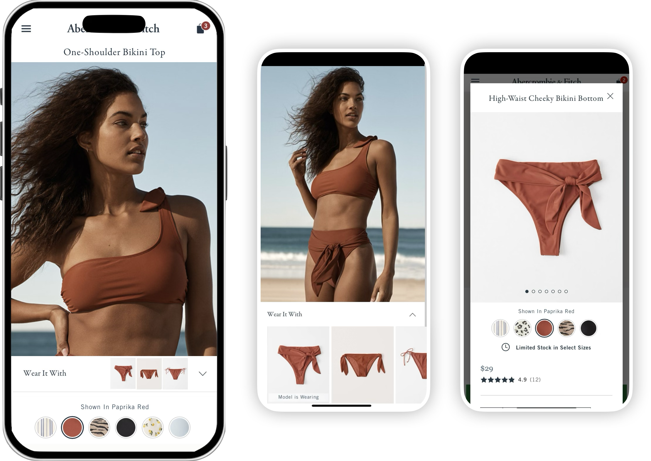
Final designs
Outcome & impact
In A/B testing, the outfitting feature outperformed control with a +1.8% lift in revenue per visit (RPV) driven by order conversion, an annualized operating margin gain of $7 million.
Informed by strategic and rigorous user research, the digital outfitting feature is an effective and engaging tool that guides users from inspiration to action, and is scalable to support more outfitting scenarios in the future.